- 欢迎访问微风软件!
- 站群首页

首要需要想好布局的思路:
用一个div大盒子包裹四个小盒子,看源代码:
<!DOCTYPE html><html lang="en">
<head>
<meta charset="UTF-8">
<meta http-equiv="X-UA-Compatible" content="IE=edge">
<meta name="viewport" content="width=device-width, initial-scale=1.0">
<title>Document</title>
<style>
* {
padding: 0;
margin: 0;
}
a {
display: block;
text-decoration: none;
color: black;
margin: 0;
}
.box {
width: 294px;
height: 300px;
text-align: center;
display: inline-block;
}
.name {
width: 100%;
height: 30px;
}
h4 {
font-weight: 400;
}
.info {
font-size: 14px;
color: #c2c2c2;
margin: 0 2px;
display: block;
}
.price {
color: #ffa365;
display: block;
margin: 2px auto;
padding: 20px 28px;
font-weight: 700;
}
</style></head>
<body>
<div class="box">
<a href="#">
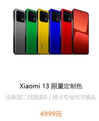
<img src="手机.jpg" alt="">
</a>
<h4 class="name">
<a href="#">Xiaomi 13 限量定制色</a>
</h4>
<span class="info">全新第二代骁龙8|徕卡专业光学镜头</span>
<span class="price">4999元</span>
</div></body>
</html>首先需要清除掉内外边距
* {
            padding: 0;
            margin: 0;
        }
然后定义大盒子box,设置长和宽。然后设置 text-align: center;方便其中的元素都可以居中显示。最后设置成行内块元素,方便后续一行放置多个展示框
.box {
            width: 294px;
            height: 300px;
            text-align: center;
            display: inline-block;
        }
在html中进行布局,先是大盒子box,然后分别是图片,标题,信息和价格四个盒子。
<div class="box">
        <a href="#">
            <img src="手机.jpg" alt="">
        </a>
        <h4 class="name">
            <a href="#">Xiaomi 13 限量定制色</a>
        </h4>
        <span class="info">全新第二代骁龙8|徕卡专业光学镜头</span>
        <span class="price">4999元</span>
    </div>
用类标签对四个小盒子设置样式
.name {
            width: 100%;
            height: 30px;
        }

        h4 {
            font-weight: 400;
        }

        .info {
            font-size: 14px;
            color: #c2c2c2;
            margin: 0 2px;
            display: block;
        }

        .price {
            color: #ffa365;
            display: block;
            margin: 2px auto;
            padding: 20px 28px;
            font-weight: 700;
        }
大功告成!以上代码就是CSS3实现一个商品展示框的方法。